The Lean for life Project are a UK fitness and health startup specifically tailored to weight loss activities and primarily geared towards females, although males are regularly involved in the program and achieve amazing results.
The Lean for life Project are a UK fitness and health startup specifically tailored to weight loss activities and primarily geared towards females, although males are regularly involved in the program and achieve amazing results.
Create eye-catching and relevant brand for TLFLP
Adobe Illustrator
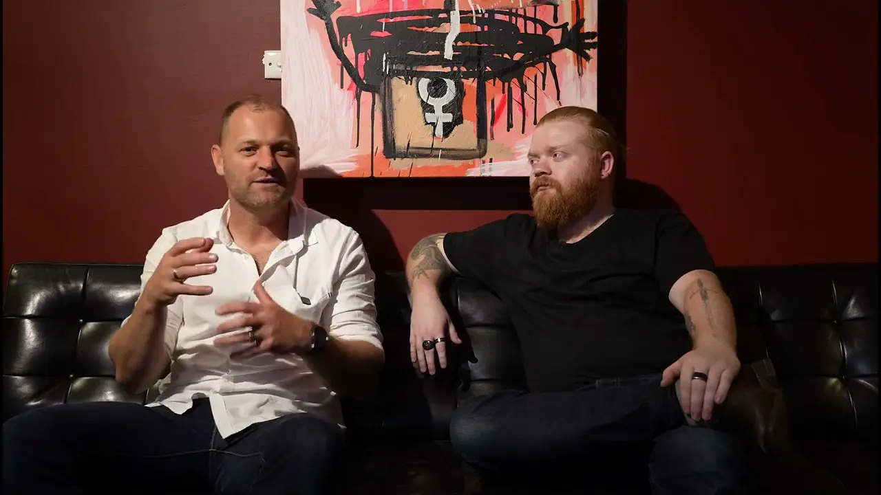
Like Seventy 30, The Lean for life Project are a UK fitness and health startup specifically tailored to weight loss activities and primarily geared towards females, although males are regularly involved in the program and achieve amazing results. With this corporate identity The Lean for Life Project wanted to differentiate themselves from the typical fitness style logo whilst still being a modern, sleek brand.
The end solution for the brand was to implement a subtle use of the female gender symbol (seeing as the brand was originally to be geared more towards females) Although this is included, The Lean For Life Project did not want to overdo the female theme by using colours such as pink (stereotypically attributes associated with femininity) The white on black also gives a cutting edge and modern feel that helps the logo jump off the page.